ShopDreamUp AI ArtDreamUp
Deviation Actions

Techy Wallpapers
9 Subscribers
So you like Techy Stuff, eh? Here you will have access to my techy wallpapers including huds cocepts.
$1/month


Suggested Deviants


Suggested Collections


You Might Like…


Description
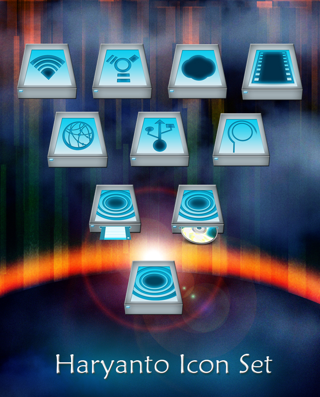
Haryanto Drive Icons - HD 512PX Drive Icons
10 Number
Please if you download this Icon Package.
10 Number
Please
Comments5
Join the community to add your comment. Already a deviant? Log In
I like the colors, but the way the field on top is put, the perspective is off. Dunno if it bothers other people, but it makes my eyes hurt. Which is too bad, becuase I like the design, and this is a good effort.